Hi my name's Laura and I am studying AS Level Media Studies. This is my blog for my music magazine.
The first we had to do was a preliminary task of making a new school magazine. We were asked to make a front cover and a contents page. I am going to be making both magazines (the school magazine and music magazine) on Photoshop.
Monday, 7 February 2011
Sunday, 6 February 2011
Code & Conventions of 'The Bishopbriggs Academy Magazine'
 The front cover of Bishopbriggs Academy magazine has a bold tile across the top of the page. It is placed here so your attention is drawn there straight away. The name of the school ‘Bishopbriggs Academy’ is right across the whole width of the page showing that this magazine belongs to their school clearly.
There is a 3 colour colour scheme of grey, blue and white that runs throughout the front cover. The background is white and the text is in grey and blue. The blue is quite eye catching compared to the grey so you are more drawn to the text written in blue as it is brighter. The front cover does not have a lot going on, it is quite minimalist and plain. The bare background and lack of writing make it this way. Because of this it is not very eye catching or exciting to look at. I don't think the minimalist approach works for the front cover of magazine so I will not be using this when I come to make my school magazine. On the otherhand I will think about using a 3 colour colour scheme in my school magazine as I think it gives a professional look.
There are 2 photos of school events on the front page. One placed in the middle third on the left hand side and the other placed in the bottom third on the right hand side. Both pictures are of sporting events, the one in the middle is of the school football team and they look as if they have won something because they have medals around their necks. The other is of what looks like a skiing trip. Both images show events/achievements that have probably recently been happening and ones that the school are obviously proud of and want to show off on the front page. They are also quite small and do not fill up the page very well. I think the front cover would look better if they pictures were larger and filled up the blank white page - this would also make the front page more eye catching too.
The school logo is placed underneath the title in the middle third of the front cover on the right hand side. Your eyes are drawn to it straight away after the title because of it being placed here. Having the school logo directly on the front makes it look a very uniformed magazine and also reinstate's which school it belongs too.
There are three circles placed at the top right hand corner of the front cover and contents page. By having these on each page it shows they are part of the same magazine and links them together. I think I will use this idea or a similar one on my school magazine as it is a small and subtle way of making all of the pages link.
On the bottom left hand corner there is the issue date. It is not something you are drawn to straight away but as it is there you are able to tell whether it is new or old etc. It is not something there for decoration but that is there to inform the reader when it was published. It is in grey writing so doesn’t catch your eye straight away but can be found for refernce purposes.
The schools magazine name “The Bishopbriggs Academy: The Magazine” is on the bottom left hand corner of every page, including the front cover and contents page in small grey writing. This reminds the reader of what magazine they are reading every page they are on and as it is in grey writing you are not drawn to it straight away but still there to see. I don't think very good on this magazine especially as it is on the front cover aswell. I will not be using this idea on my school magazine.
The contents page of Bishopbriggs School magazine has the same 3 colour colour scheme as the front page – blue, white and grey. The predominant colours are white and blue. White is used for the background and blue for the majority of the text. The only grey bit on the contents page is the magazine name in the bottom left hand corner like the front page.
In bold letters across the top of the page are “In the issue...” This shows the read it is the contents page without actually says ‘contents’. The bold letters and size of the text draw your eyes to it straight away tell you what the page is.
 Running down the left hand side in the first and second third of the page are the titles of each page followed by a brief description of what it is about in italics underneath. This shows the reader what each page is about without them having to turn to each page to have a look. The page numbers locating where to find each section run alongside each description but on the right hand side of the page. This is a very uniformed way of setting out the contents page.
 The page number you are currently on is shown in a blue circle – the same size and colour as the three circles that run along the top right hand side of each page – on the bottom right hand side. The number is in white. The page numbers are shown in the same colour scheme as the rest of the page and also the reoccurring theme of circles is used too. By using both these two features it links the magazine together and makes it look matching and organised.
Saturday, 5 February 2011
School Magazine - Preliminary Task
When making my school magazine I took into consideration the codes and conventions found in 'The Bishopbriggs Academy Magazine' I looked at at the start. This magazine was very plain and simple, but also got across the main features of the magazine. I used ideas found in 'The Bishopbriggs Academy Magazine' on mine. I am very pleased with the final outcome of my front cover and magazine, especially in the short time scale given to do it in. I am also pleased with the progress I have made using Photoshop and also doing photography. I look forward to beginning the main task.
I have included my front cover and contents page below.


I have included my front cover and contents page below.


Friday, 4 February 2011
Evaluation for my Preliminary Task
By looking at ‘The Bishopbriggs Academy Magazine’ I was able to look at the conventions used in an existing school magazine. I was then able to use some of these conventions on my own magazine and it also helped to know what sorts of features are usually seen on a school magazine.
On the top right hand corner of ‘The Bishopbriggs Academy Magazine’ there are three circles all the same size, these circles continued on every page linking it all together. I decided to use this idea on my magazine as I liked how it made the magazine fit together. I used 3 small squares on the top left hand corner of both my front cover and contents page. ‘The Bishopbriggs Academy Magazine’ has a very minimalist front cover and contents page. Both have a plain white background and use a simple tri colour scheme of blue, grey and white. I decided to use a plain colour scheme in my magazine as I think it looks effective. I did not use a plain white background like the one in ‘The Bishopbriggs Academy Magazine’ on my front cover as I didn’t think it looked exciting nor grabbed your attention – although, I did use it for my contents page. On ‘The Bishopbriggs Academy Magazine’ they used a uniformed list to show what was in their magazine on their contents page. I liked this way and thought it was easy to read and showed the titles clearly, therefore I decided to use this layout on my contents page. ‘The Bishopbriggs Academy Magazine’ also had a brief description of what each page was about under its title in italics on their contents page. I thought this idea was simple yet effective and showed the reader a quick explanation of what could be found on each page. I used this idea on my contents page as I think the layout is easy to read and understand. I have put the name of my magazine in the bottom right hand corner next to the page number on my contents page. ‘The Bishopbriggs Academy Magazine’ uses this idea but on the bottom left hand side. I like this feature as I think it looks very professional and a lot of established well-known magazines do this, which reminds you of what magazine you are reading on each page.
Through producing my school magazine I have learnt many new skills.
Firstly, I have learnt how to use an SLR Camera. I’ve learnt features such as focusing the camera and how to zoom as well as changing the aperture and shutter speed. I was able to the skills I learnt about aperture when I came to take my photo for my front cover. I changed the aperture so that the model was in focus but the background was not.
For all of the photos I have included in my school magazine I used natural light. I took the photos in the day time and it already quite light areas so artificial lights were not needed. The flash on the camera helped the look of the photos too.
I have also developed my skills on Photoshop throughout this project. I had basic Photoshop skills before I started making my front cover and contents page but I have learnt many more advanced skills through doing so. Some of the skills I used while creating my front cover and contents page were merging and linking layers. I merged the layers when doing the 3 squares in the top left hand corner of each page. This meant that they became one layer instead of 3 which was good when I was trying to get them in the right place as it meant they were all in the right position and moved as one piece. Another tool I used was the colour dropper tool. This tool lets you take a colour from either a picture or text already in use on your page and use it for something else. I used this tool to make sure I used the same shade of navy throughout my front cover and contents page.
Thursday, 3 February 2011
Week 1
This week I started the preliminary task of the coursework – making a front cover and contents page of a new school magazine. I started by looking at the codes and conventions found of an existing school magazine. I looked at ‘The Bishopbriggs Academy Magazine’. I was then able to use this as inspiration for when I came to make my own school magazine. I then made this blog so I could keep a log of my work.
I then went out and took photos of my friend Iona to put on the front cover of my magazine. I also took pictures of plants and other students working around the school for my insert pictures of my magazine. Once I had done this I started to put together my magazine front cover and contents page on Photoshop. The version of Photoshop I used was Elements 4.
Next week I am going to start looking at the codes and conventions of music magazines. I am going to analysis 5 front covers, 5 contents pages and 5 double-page spreads. I am going to look predominately at ‘Q’. This is because I know I want to make a mature music magazine for popular and/or upcoming music artists/bands and having looked at a range of currently available music magazines I feel ‘Q’ is the most similar to what I am looking to create myself.
Wednesday, 2 February 2011
Week 2
This week we analysed different magazine front covers. We looked at codes and conventions of existing magazines and what you usually find on their front covers, content pages and double paged spreads. This helped me know what type of features to put on the music magazine I am going to be making and also what type of features are on existing magazines I am using as inspiration.
Next week, I am going to look at target audience research and create an initial ideas mind map of what I am planning to do.
Tuesday, 1 February 2011
Typical Features of Existing Music Magazines
This week we have been looking at different features of existing music magazines. I have found that different genres of music use very different features. For instance a Kerrang magzine which features rock bands looks and uses different codes and conventions to a pop magazine such as Top of the Pops. I have included some images of different genre music magzines below:


Week 3
This week I have made an initial ideas mind map which explains my initial ideas and thoughts of what I am going to be doing on my music magazine front cover, contents page and double page spread. This included points such as what fonts I might use and what sort of photos I will use.
Also, this week I have done some target audience research. I have made a questionnaire and I have decided what sort of people I will ask. I will be carrying out this research next week.
Over the next couple of weeks I am going to be finishing off the work I have been doing this week so that I am ready to start the initial draft of my music magazine.
Monday, 31 January 2011
Initial Ideas for my Music Magazine
I have made a mind map of my initial ideas for the music magazine I am going to be making. I have included ideas about possible stories, fonts, target audience and colour schemes. I have included it below:


Sunday, 30 January 2011
Analysis of Q Magazine - June 2010
FRONT COVER:
The front cover of this issue of Q is more plain than normal. It just has about Paul McCartney on the front, no other stories about other bands or artists. I think this is because Paul McCartney is such a mega start that people will buy the magazine sorely to read about him and regular Q readers will buy the magazine regardless of who is on the front.
 The colour scheme consists of 4 colours; red, white, black and gold. I like the four colour colour scheme and how the colours used all match in together. The red used is the brightest and boldest colour and stands out a lot against the black and red. The gold used in only used as a background to Paul McCartney’s name – this symbolises his importance. Also, I like the use of 4 colours on the front cover as I think it very professional and mature and I think using more than 4 on the front would look to unorganised and jumbled.
The Q logo is positioned in the top left corner. The logo is simply a white Q on a red block square background. The logo is very simple but effective and stands out on the plain white background of the front cover.
The barcode, price and date of the issue are positioned in the top right hand corner. It is not the most dominant thing on the front but is there to inform the readers and buyers and the price and when the issue was published. This issue is from June 2010 and is priced at £3.99.
The main image on the front is of Paul McCartney and it is a medium close up. Usually either medium close ups or long shots are used on the front covers of music magazines. This image on the front is in black and white. I think this looks good as the red and white writing stands out on the black photograph. The photo takes up the majority of the front cover which draws your eyes to it as that is the main focus on the page.
There is a quote by Paul McCartney that takes up the majority of the bottom third, which says; “It’s impossible to live up to the Beatles”. It is written capitals and red serif font. It is very eye catching as the red standing out against the black of his coat. The quote used on the front will draw people to buy the magazine too. Just above the quote in smaller writing is “Paul McCartney”. It is in black serif font and has a gold rectangular background. With his name being outlined in gold, it shows how important he is and his royalty in the music industry. Underneath the quote in considerably smaller writing it says “The fab Q interview, shot by David Bailey”. Having this just underneath the quote shows the audience that there is an interview with Paul McCartney inside and not just an article about him. Also, by having David Bailey’s name on the front cover people who are a fan of his work are likely to buy the magazine too. This is because he is a very famous photographer who has done a lot of work for other well established music artists.
All font on the front cover is in serif. I think this is because it is quite a mature looking font and as Q targets more mature people the font works very well. I prefer this type of font to sans-serif, but think they are both used to create different looks.
CONTENTS PAGE:

DOUBLE PAGE SPREAD:
 This double page spread’s colour scheme consists of three colours; red, white and black. This is the same colour as found on the contents page and front cover. I like the way the colour scheme is organised and is kept the same throughout the magazine. I think it shows each page to be linked and you can see that they all come from the same magazine. The colours used are also easy to see and read, so you do not have to focus on bright harsh colours or lots of very dark colours together. I think I will use a reoccurring colour scheme throughout my magazine as I think it looks sophisticated which will appeal to the target audience.
Just above the band’s name “Chapel Club” there is a red square with ‘New to Q’ written in white in it. It is just like the Q logo but with ‘New to’ put in the top left hand corner. I like the way they have done reoccurring things throughout their magazine as it shows it all links together and creates familiarity for the reader.
CONTENTS PAGE:
The colour scheme on this contents page is red, white and black. This is the same as the font cover of this magazine apart from there is no gold. I like how the colour scheme is the same from the front cover to the contents page as I think it links the magazine together and makes it look organised. I will probably use this idea in my magazine.

There are 3 sections of the contents page – features, regulars and Q review. I like how there are two main sections (features and regulars) and how you can easily find things you like to read week after week in the regulars column but also find the stuff that’s just in this month’s issue in the features column. The features column is almost like a ‘On the cover’ section that you can sometimes find in other magazines. The features are found down the left hand side, regulars down the right hand side and then the Q review can be found at the bottom of the right hand page.
There is a red banner that runs right across the top of the page. At the far left hand side there is a white Q (the same as the one from the Q magazine logo). This is to remind you of the magazine you are reader. ‘Contents’ is then written in black writing a bit smaller in size straight after it. The at the far right hand side in smaller writing again but this time in white font is the issue number, in this case Issue 287. The red banner across the top acts as an information banner with the magazine title, page title and issue number on. I like the banner idea and I am going to think about using it in my magazines contents page.
In the top right hand corner there is a small photo of the front cover. I like this idea and I think it looks very professional. I think I will use this idea on my front cover as it will make look like a real magazine and also I think it links the two pages (front cover and contents page) together.
There are lots of photographs on the contents page. They are predominately in the middle of the two pages and they have page numbers in the corners either written in black or white. Using black or white for this fits in with the colour scheme of red, black and white. As well as photos of the bands and artists on the contents page there are also pictures of pages within the magazine. I like the mixture of both of them as it looks varied and not all the same.
The issue date, page number and Q logo is in the bottom corner of each page. This is there to inform of the reader of the date of the issue and what page they are on.
Underneath each title of different pages of the magazine on the contents page there is a brief description of what it is about. This is helpful to the reader as they can read what it is about on the contents page and see if they want to read more about it or not without flicking back and forth from each page inside the magazine and the contents page. I will be using this idea on my contents page.
DOUBLE PAGE SPREAD:
 This double page spread’s colour scheme consists of three colours; red, white and black. This is the same colour as found on the contents page and front cover. I like the way the colour scheme is organised and is kept the same throughout the magazine. I think it shows each page to be linked and you can see that they all come from the same magazine. The colours used are also easy to see and read, so you do not have to focus on bright harsh colours or lots of very dark colours together. I think I will use a reoccurring colour scheme throughout my magazine as I think it looks sophisticated which will appeal to the target audience.
 The photo is used as the background of this double page spread. The band is trying to recreate the iconic Beatles album cover when they recorded at Abbey Road. They have made it their own by wearing animal head masks – this also adds a comedic element. I like how they have done this as they are recreating a very famous image but are adding their own twist. It also shows that the band don’t take themselves too seriously by wearing animal masks.
There are two columns of writing at the bottom of the left hand page. It is in white writing and serif font. I don’t think two columns of writing looks as good as three would. I think it looks a bit too bare and unprofessional. I will be using three columns of writing on my double page spread.
The issue date, page number and Q logo is in the bottom corner of each page. This informs the reader of the issue they are reader, what page they are on and the magazine logo. As it is in the same place and is the same size on every page it is easy for the reader to find each page and it also looks organised this way too.
There is a drop capital at the beginning of the article. I like the use of drop capitals at the beginning of an article and will think about using one on my article.
Saturday, 29 January 2011
Analysis of Q Magazine - October 2010
FRONT COVER:
The front cover of this edition of Q has a colour scheme consisting of 4 colours: red, white, black and orange. I like the use of the 4 colours especially the use of one brighter colour (orange) highlighting important things to catch the audience’s eyes. I think I am going to use a 4 colour colour scheme on my front cover as I think it looks just the right amount.

Directly underneath the logo is says ’10 Exclusive Interviews’ then directly underneath that in big, bold, orange, sans-serif font are three names: JAY-Z, LADY GAGA, DAVE GROHL. Having these names in large letters on the front draws people to buy the magazine who like and are interested in reading about these artists. There is a quote from each artist in smaller black font under their names too. This gives the reader a taste of what is coming in the interview. The quotes used are all interesting and make people want to buy the magazine too.
The photo on the front is of Jay-Z, Lady Gaga and Dave Grohl. They are all long shots and are all dressed in black. As they are dressed in black they all match and also fit in with the colour scheme.
‘THE 10 MOST EXCITING PEOPLE IN MUSIC NOW’ is in bold font across the top of the page. It is in white writing on a black background – apart from ‘exciting people’ which is in a lot larger writing and in black font on an orange semi-circle background. Having this across the top draws your eyes to ‘exciting people’ and makes the audience buying the magazine want to find out who Q class as the most exciting people.
 FRONT COVER – subscription edition:
Q does different cover for subscribers. For example, this is the cover for subscribers from this issue of Q. It is very plain in comparison – only having a close-up of Jay-z on the front and virtually no text. I think this is because Q does not have to advertise what’s inside to subscription members. Also, as it is different to the regular issue found in shops it gives something special to subscribers as the image on the front is usually only taken for the subscribers cover.
CONTENTS PAGE:
The contents page has a three colour colour scheme of red, white and black. The colour scheme is carried on from the contents page except the front cover has orange on it too and then contents does not. I like the use of the reoccurring colour scheme as I think it looks very good and connects the whole magazine together. I think I am going to use the idea on my magazine as I like the way it links everything together as well as looking quite sophisticated.
There is a red banner across the top of the contents page which has ‘Q’ and ‘Contents’ written on the left hand side and ‘Issue 291’ on the right hand side. I like the use of the red banner across the top as it instantly tells you what magazine you’re reading as well as the issue you’re reading too.
The contents page is split up into three sections: features, regulars and Q review. I like the way the contents is sectioned off as it makes it easier to read and also looks a lot more orderly. I am going to think about using sections on my contents page as I think it looks a lot more organised and professional.

The background of the contents page is plain white. Only red and black writing is then used. The use of the plain background is quite minimalist but the use of coloured writing and images does not make it look this way.
DOUBLE PAGE SPREAD:
This double page spread has a colour scheme consisting of three colours: red, white and black. The background is white and all the text is either black or red. The plain white background is the same as the plain white background found on both the front cover and contents page that I looked at. I like the use of a plain background as you can then use any colour writing or images over the top and it should look ok.
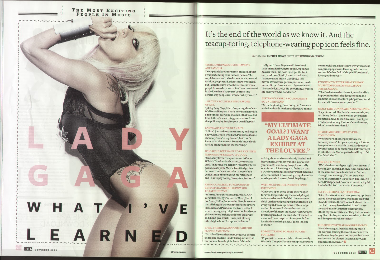
There is a bold quote in red capitals in the middle of the middle column. The quote really stands out in the middle of the black text. The use of the thick red line above the quote helps it stand out too. The red line also separates up the quote from the small black text too.
The photograph of Lady Gaga is a medium shot. She is wearing black white also matches in with the colour scheme used.
The title of the double page spread takes up half the left hand page and is written over the top of the photo of Lady Gaga. The whole title is in sans-serif font. ‘LADY GAGA’ is written in red and is the largest writing and ‘WHAT I’VE LEARNED’ is underneath this in black writing and is smaller in size.
Friday, 28 January 2011
Analysis of Q Magazine - December 2010
FRONT COVER:
The front cover of this issue of Q has the same colour scheme as found on other issues of Q that I have looked at. This colour scheme is red, black, white and gold. The reoccurring colour scheme can be linked with the magazine.

The Q logo is found in the top left hand corner. It is located here month after month. The logo has a square block red background with a big white Q in serif font in the middle. I like the Q logo as I think it is very simple but looks very effective. Also, I think because it is made up of the colours used in the colour scheme of the front cover it matches in and makes the front look very professional as well as orderly too.
There is only one image on the front. It is in the middle and takes up the majority of the space. The photo is of the band Take That. They are piled on top of each other, all laughing and smiling. Because of this it shows people looking at it that they are happy to be back together and all getting along. The text at the top of the page questions this though.
At the top right hand corner in large black serif font (in capital letters) is ‘TAKE THAT’. As this is the largest piece of text on the front cover, your eyes are drawn to this as well as the main image. Having the bands name in large letters shows people looking at the magazine who is featured in this issue and also catches people’s eyes when they are looking at the magazine racks. Just above ‘TAKE THAT’ in red capitals is ‘THE WORLD EXCLUSIVE’. This shows the audience that this is the first place they have been interviewed which will make more people want to buy the magazine as it is an exclusive. Then just underneath ‘TAKE THAT’ in red serif font is ‘Back for good?’ When people first see this they will want to read the interview to see what doubts that they won’t stay together. This is also a play on words as one of Take That’s most famous songs is called Back for good.
The front page is mainly focussed on Take That. I think this is because they are such a huge band and Robbie Williams rejoining the band was a massive event. As it is very focussed on them, many Take That fans who don’t read Q will buy the magazine and regular Q readers will buy it anyway no matter who is on the front cover.
There are only 3 other stories on the front cover:
1. A year inside Green Day
2. Q Awards – winners revealed
3. Live Blowout!
Serif font is only used for the Q Awards story. This is gold circle with white and black writing inside. Sans-serif font is used for the other two stories because it is a lot bolder. I like the mixture of both types of font used on the front cover and I am going to think about doing this on my front cover as I think both fonts are used to represent entirely different things/stories.
CONTENTS PAGE:
The contents page of Q is practically the same every month. It has 3 sections: features, regulars and Q review. They are positioned in the same place each month too – features down left hand side, regulars down right hand side and Q review at the bottom of the right hand page. Doing this creates familiarity and Q readers get used to it so can find sections easily each month.

There are images illustrating the stories found in the magazines in the middle of the content page. Not all pages are written about though - some are just shown by photos/images with numbers in the middle of the two pages. I like how they have done this as it makes the contents page less text dominated and more a mixture of both text and pictures.
There is a banner across the top of the page. This is a regular feature found on the contents page. It has ‘Q’, ‘Contents’ and ‘Issue 293’ written on it. It is used to show what page you are on and the number of the issue you’re reading.
The Q logo, page number and issue date is in the bottom corner of every page. This just reminds you of the issue you are reading and the pages number are there so you know which page it is. I am going to put the magazine logo and issue date next to the page number on my magazine as I like the way it looks.
Not all the image found in the middle of the contents page are photographs of bands or artists – some are images of pages found inside the magazine. I like this idea as it promotes the content of the magazine and it is an original idea. I am going to think about using this on my contents page as I think it looks unique and quirky.
DOUBLE PAGE SPREAD:
 There is a small title at the top of the page. It simply says ‘Take That’ but is written as ‘Take THAT’. I like that way they have done this as I think it looks quite original. I am going to experiment with mixing lower case and capitals on my magazine.
The colour scheme on this double page spread consists of three colours: red, white and black. This is the same theme as found throughout the rest of the magazine.
DOUBLE PAGE SPREAD:
The text on this double page spread is located on the left hand page and then there are two photos on the right hand side. I prefer the text and pictures on the opposite sides on the pages as I just think it looks altogether better.
There is a big drop capital in red at the beginning of the article. It is bigger than the usual ones you see as it takes up roughly a quarter of the page. I like the use of the drop capital and with it being red it looks good under the black text.

A quote in bold red capitals splits up the text in the second column. There is a thick red line above the quote too. I like the way the quote splits up the text creating a gap as I think it makes it look easier to read. By using the red line above the quote makes it stand out and also separates the quote from the rest of the text. I am going to use the quote idea on my double page spread.
There are only two columns of text. I don’t think this looks as good as the use of three columns because I think three generally looks better.
The two images on the right hand page are both in black and white. They are both the same size too. The top one is of Take That standing on a wall and the bottom one is of them jumping off. The before and after shot looks ok but I think one image or many smaller images look better.
Thursday, 27 January 2011
Analysis of MOJO Magazine - November 2010
FRONT COVER:
The colour scheme from this front cover is black, white, red and grey. I like how they have only used one bright colour (red) as they have used this to highlight the most important things written on the front cover.

‘MOJO’ is written in black, bold capitals at the top of the page. It is covered by some of the main image but as it is a well established music magazine people already know what it is called so it is not necessary to be able to see the full name. It is located at the top of the page.
‘The doors’ is written across the middle of the page. ‘The ‘ is written in considerably smaller writing than ‘doors’ only sitting on top of the ‘d’. As this is the main focus on the page the audience see that this band is the main feature of this issue. Advertising a band across the middle of the page also grabs people’s attention that aren’t MOJO readers but will buy the magazine because they like the band.
The majority of the text is in sans-serif, I think this is because it is bolder and this fits in with the style of the front cover too.
Unlike other magazines I have looked at, this issue of MOJO has 2 insert images as well as the main image found in the middle. The main image is a high angle long shot and it also in black and white. The 1st small image is in the top right hand corner. It is quite small and of John Lennon. The 2nd is of a colourful butterfly and is located over the ‘M’ of MOJO. They are both used to promote stories inside the magazine. I think the use of both these insert images looks quite good as they are both small in size, but I think if there was any more or if they were bigger in size it would not look very good and just look quite messy.
CONTENTS PAGE:
This contents page is split up onto 2 separate pages. They are located back to back in the magazine. The first one has an image as the background. The photo is of Edwyn Collins, is in black and white and a medium close-up. It is located on the right hand side – the rest is of scenery and is slightly out of focus.

The colour scheme on this page consists of 3 colours: black, white and red. This is the same as the one found on the front cover. Using a reoccurring colour scheme links the magazine all together. Q has the same colour scheme running throughout the whole magazine, but MOJO doesn’t.
The MOJO logo is at the top in white. It is the same as the one found on the front cover but in a lot smaller in size (and a different colours). There is a banner underneath it with the date of the issue on (NOVEMBER 2010) and the issue number (Issue 204). Both these are written in white sans-serif font.
This contents page is split up into 2 sections: features and cover story. They both run down the left hand side.
There is a quote in the bottom right hand corner. This is used to advertise another story inside the magazine. I like how they vary the way of advertising their stories.
The page number and MOJO logo is in the bottom left hand corner. The page number is in bold but the MOJO logo is not. This is found in the bottom corner of every page.

DOUBLE PAGE SPREAD:

The first 2 words of the article are in capitals. This is the same sort of idea as a drop capital but isn’t as noticeable. I like it as it clearly shows where the article starts but does so quite subtly
The 2nd contents page has a plain white background. There is a collage of pictures down the left hand side. These are of album covers, live gigs and posed photos of b ands/artists that are all featured in the magazine.

This page is split into 3 sections: regulars, what goes on! and the mojo filter. These are all in a list down the right hand side. The use of sections makes the contents page easier to read and also the way photos are used to advertise some stories makes the page look less image dominated.
The colour scheme of this page is gold, red, black and white. It is the same as the first contents page apart from gold has been added. Keeping the colour scheme the same shows both pages are together and show the same topic, which might not be obvious at first as they are on separate pages (back to back in the magazine).
DOUBLE PAGE SPREAD:
The whole of the right hand page is taken up by an image. All of the text is on the left hand page. The text is split up into 2 columns. Compared to other examples I have seen, I like that 3 columns of text on a double page spread tends to look a lot better than just 2.
The colour scheme consists of 4 colours: black, blue, gold and white. Some colours are the same as the colours seen on the front cover and contents page. The colour scheme is similar throughout but not exactly the same.

‘FILTER ALBUM’ is written in the top left hand corner of the left hand page. This is the section of the magazine this article is from. I like how it tells you what section you’re on on the page as I think it makes the magazine easier to read and also look through as you know where about you are too.
There is a fact sheet about the album being reviewed – Kings Of Leon, Come Around Sundown – in the middle of the 2 columns of text. I like how they’ve split the text by doing this which makes it easier to read and look at.
Wednesday, 26 January 2011
Analysis of MOJO Magazine - January 2011
FRONT COVER:
This issue of MOJO has a colour scheme consisting of four colours: black, white, silver and fold. I like the use of a four colour colour scheme as I think it looks just the right amount of colours for a front cover. The four colours MOJO has used complement each other very well – the silver and gold go well together as do the black and white. If the colours didn’t match I don’t think the front cover would look as effective.

The MOJO logo is across the top of the page. It is written in black, bold, sans-serif font. It is also in capitals. It is a bold logo that goes right along the whole width of the page. ‘Music Magazine’ is then written across the JO. It is in tiny writing compared to the main title and also written in gold so fits in with the colour scheme found on the front cover.
‘QUEEN’ is written right across the middle of the page. It is written in white serif font and has a gold border. As it is the biggest text on the page the audience will see that they are the main feature of this issue and also, non MOJO readers who are fans of QUEEN will buy the issue too.
There is lots of other text around the outside sides of the front cover. It is all written in either silver or gold font. The front cover is quite busy compared to other ones I have looked at.
The barcode is in the bottom right hand corner. This issue of MOJO is from January 2011 and was £4.50.
In the top left hand corner MOJO advertise a free CD. This also entices people to buy the magazine too.
COMPARED TO Q:
MOJO and Q front covers are quite different. MOJO is a lot busier than Q and has more information on the front. Q tends to just advertise a few stories that are featured inside however, MOJO fill both sides and the top with what can be found inside that issue. I prefer Q’s more minimalist approach.
MOJO is a little bit more expensive than Q being £4.50 whereas, Q is only £3.99. Both prices are fairly similar and both reasonable prices for good quality music magazines.
Q does not advertise free gifts or give them regularly, but both issues of MOJO I have looked at both advertise free CD’s. This might also be why MOJO is a little bit more expensive.
MOJO does not have a reoccurring front cover colour scheme. 2 out of 3 of the Q covers I looked at do and the other one I liked at didn’t – but it only changed gold for orange so was still easily.
CONTENTS PAGE:
This contents page is separated on 2 single pages back to back. The 1st page has a picture of two members of the ban Arcade Fire used as a background. I like the use of a photo as the background as the background is quite blurred – only the two band members are in focus.
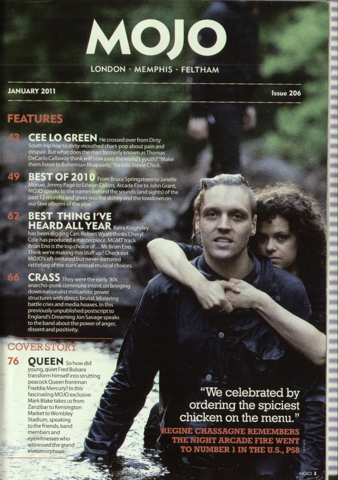
The MOJO logo is at the top of the page, this time in white and not black which is seen on the front cover. There is a banner just under the logo with ‘JANUARY 2011’ and ‘Issue 206’ written on it. This is used to inform the reader when the issue is from and also what number issue it is.
There are two sections on this page – both run down the left hand side. The first is ‘features’ and the second is ‘cover story’. Both titles are written in red. There is a quote in the bottom right hand corner. This is used to advertise a story inside the magazine.
There is a mixture of serif and sans-serif font used on the page. I like the way there is a mixture as I think different fonts can be used to show different things.
The MOJO logo and page number are found in the bottom corner of the page. This is so they are easily seen when flicking through the magazine.
The 2nd contents page has a plain white background and a collage of pictures down the left hand side. The pictures are used to promote stories found inside the magazine, as not all stories are written about. There is a small description and page number in the corner of every picture telling the reader what it is and where to find it.

There are 3 sections on this page: regulars, what does on! and the mojo filter. As it is split up into separate sections it makes the contents page easier to read and understand. Also, they are all written in list form which makes it easy to read too.
The colour scheme found on this page is made up of 4 colours: black, red, gold and white. The colour scheme is the same as the one found on the first contents page but gold has been added. As gold is seen on the front cover you begin to vaguely see a set colour scheme but it is not as strict as Q’s.
DIFFERENT TO Q:
There is no fixed colour scheme running from the front cover to the contents page. Some colours used on the contents page are featured on the front cover but not all are. Also, MOJO’s contents page is split up into two single pages whereas Q’s is across a double page spread. I like both layouts as Q’s layout looks good with the pictures in the middle and it is very easy to read as it is all on one double page spread. But, I also like the way MOJO’s two contents pages are completely different and that you are able to create two very different pages showing what is inside your magazine. For my contents page I think I am going to take a lot of inspiration from content pages found in Q but do it on one A4 sized page.
SIMILAR TO Q:
MOJO and Q both use a banner idea at the top of the contents page to show the date of the issue and what issue number it is. They also both split their contents pages up into sections. MOJO uses 5 different sections whereas Q only use 3.
DOUBLE PAGE SPREAD:
 There is a quote in a blue circle overlapping onto the photo on the right hand page. I like the use of a quote but I’m not too keen on it in a circle as I don’t think it fits with the overall look of the page.
DOUBLE PAGE SPREAD:
This double page spread has one long image that runs across the top of both pages. It takes up roughly 2/3 of the page length wise. The image is of a live gig.

There are 3 columns of text on each page. I like the use of 3 columns of text instead of 2 columns that I have seen on other examples I’ve looked at. I am going to use 3 columns on my double page spread.
The colour scheme of this page consists of 3 colours – black, blue and gold. Unlike Q, MOJO does not use a colour scheme that run throughout the whole magazine.
There is a mix of serif and sans-serif font used. Sans-serif is used for the main title, quote and setlist. Serif font is used for the sun-title and the main article. I like the use of both fonts being used on the one page.
Subscribe to:
Comments (Atom)