FRONT COVER:
The front cover of this edition of Q has a colour scheme consisting of 4 colours: red, white, black and orange. I like the use of the 4 colours especially the use of one brighter colour (orange) highlighting important things to catch the audience’s eyes. I think I am going to use a 4 colour colour scheme on my front cover as I think it looks just the right amount.

Directly underneath the logo is says ’10 Exclusive Interviews’ then directly underneath that in big, bold, orange, sans-serif font are three names: JAY-Z, LADY GAGA, DAVE GROHL. Having these names in large letters on the front draws people to buy the magazine who like and are interested in reading about these artists. There is a quote from each artist in smaller black font under their names too. This gives the reader a taste of what is coming in the interview. The quotes used are all interesting and make people want to buy the magazine too.
The photo on the front is of Jay-Z, Lady Gaga and Dave Grohl. They are all long shots and are all dressed in black. As they are dressed in black they all match and also fit in with the colour scheme.
‘THE 10 MOST EXCITING PEOPLE IN MUSIC NOW’ is in bold font across the top of the page. It is in white writing on a black background – apart from ‘exciting people’ which is in a lot larger writing and in black font on an orange semi-circle background. Having this across the top draws your eyes to ‘exciting people’ and makes the audience buying the magazine want to find out who Q class as the most exciting people.
 FRONT COVER – subscription edition:
Q does different cover for subscribers. For example, this is the cover for subscribers from this issue of Q. It is very plain in comparison – only having a close-up of Jay-z on the front and virtually no text. I think this is because Q does not have to advertise what’s inside to subscription members. Also, as it is different to the regular issue found in shops it gives something special to subscribers as the image on the front is usually only taken for the subscribers cover.
CONTENTS PAGE:
The contents page has a three colour colour scheme of red, white and black. The colour scheme is carried on from the contents page except the front cover has orange on it too and then contents does not. I like the use of the reoccurring colour scheme as I think it looks very good and connects the whole magazine together. I think I am going to use the idea on my magazine as I like the way it links everything together as well as looking quite sophisticated.
There is a red banner across the top of the contents page which has ‘Q’ and ‘Contents’ written on the left hand side and ‘Issue 291’ on the right hand side. I like the use of the red banner across the top as it instantly tells you what magazine you’re reading as well as the issue you’re reading too.
The contents page is split up into three sections: features, regulars and Q review. I like the way the contents is sectioned off as it makes it easier to read and also looks a lot more orderly. I am going to think about using sections on my contents page as I think it looks a lot more organised and professional.

The background of the contents page is plain white. Only red and black writing is then used. The use of the plain background is quite minimalist but the use of coloured writing and images does not make it look this way.
DOUBLE PAGE SPREAD:
This double page spread has a colour scheme consisting of three colours: red, white and black. The background is white and all the text is either black or red. The plain white background is the same as the plain white background found on both the front cover and contents page that I looked at. I like the use of a plain background as you can then use any colour writing or images over the top and it should look ok.
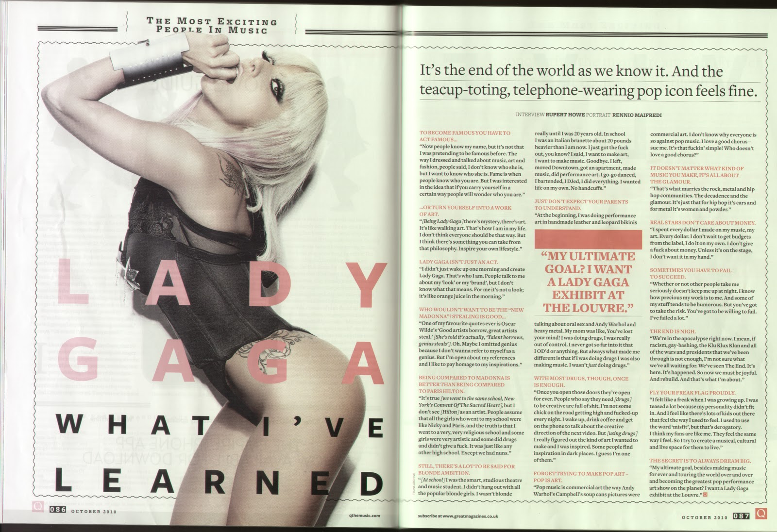
There is a bold quote in red capitals in the middle of the middle column. The quote really stands out in the middle of the black text. The use of the thick red line above the quote helps it stand out too. The red line also separates up the quote from the small black text too.
The photograph of Lady Gaga is a medium shot. She is wearing black white also matches in with the colour scheme used.
The title of the double page spread takes up half the left hand page and is written over the top of the photo of Lady Gaga. The whole title is in sans-serif font. ‘LADY GAGA’ is written in red and is the largest writing and ‘WHAT I’VE LEARNED’ is underneath this in black writing and is smaller in size.
No comments:
Post a Comment